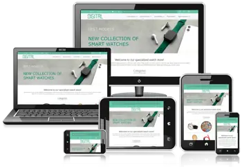
Description
💻 Noro Demo: View Noro Demo
The Smartstore Noro Theme is a modern, minimalist, and fully responsive theme designed specifically for Smartstore versions 3 and 4. Ideal for online stores with large and diverse catalogs, Noro delivers an exceptional shopping experience with a clean, full-width design that looks perfect on desktops, tablets, and mobile devices.
If you are looking for a similar theme for Smartstore version 6 and above, check out Ovela Smartstore Theme, designed for home decor stores with modern, optimized features.
Key Features of Smartstore Noro:
-
Responsive Design: Automatically adapts to any screen size for a seamless shopping experience on desktop, tablet, and mobile.
-
Mega Menu: Create multi-level navigation menus for easy access to categories, products, and important store sections.
-
RTL Support: Fully compatible with right-to-left languages like Persian and Arabic for a professional user experience.
-
Optimized Navigation: Streamlined header and menu structure ensures quick access to products and categories.
-
Easy Customization: Colors, fonts, and layouts can be easily adjusted to match your store’s branding.
-
Performance Optimized: Built with clean, standards-compliant code to improve page load speed and user experience.
-
Module Compatibility: Works seamlessly with Smartstore modules and supports adding custom extensions.
Smartstore Noro is the perfect choice for large and professional online stores that want a combination of modern design, high performance, and excellent user experience.
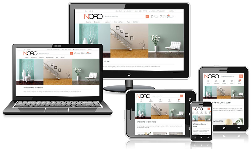
This theme is responsive and makes web pages render well on a variety of devices and window or screen sizes. Responsive design is an approach to web page creation that makes use of flexible layouts, flexible images and cascading style sheet media queries.
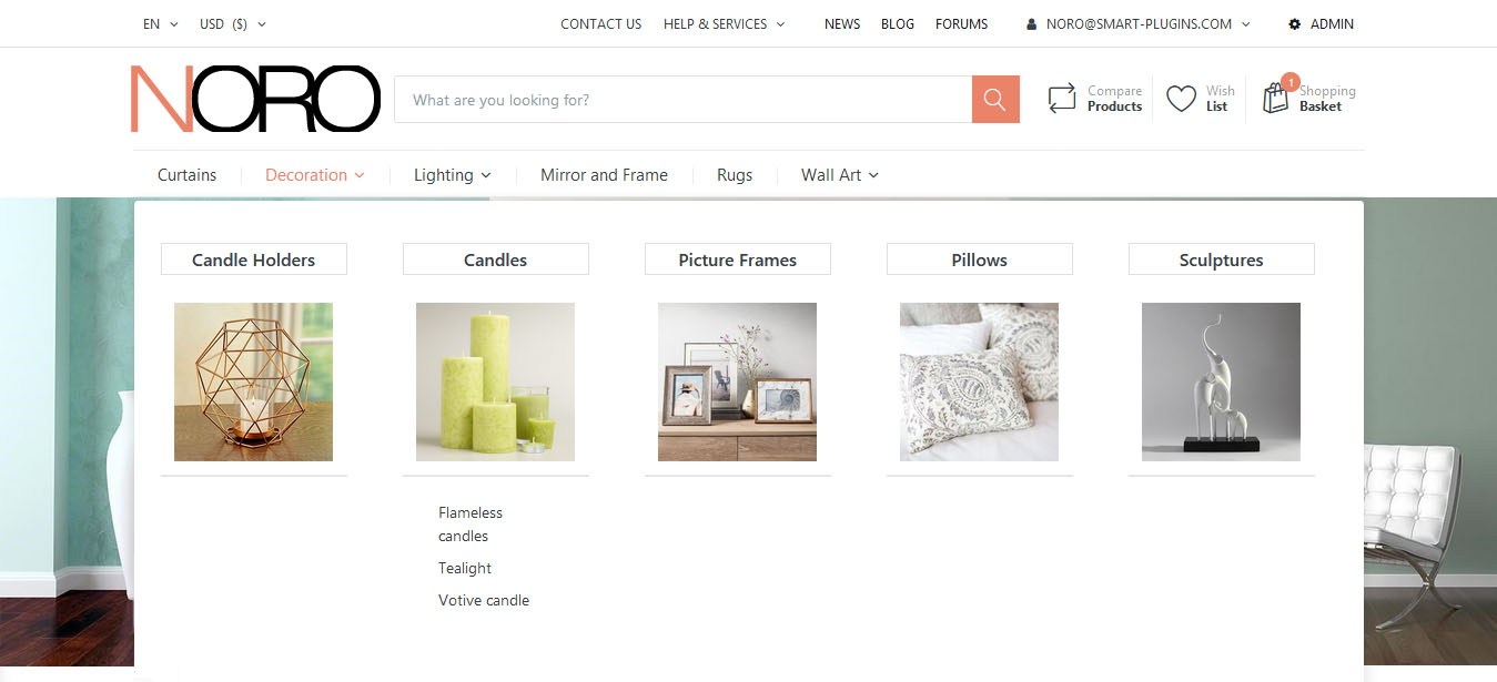
Mega Menu plugin adds a powerful drop-down menu for an effective and easy navigation. Mega menu is a drop-down menu with multi-level expansions that lets you pack your website’s entire navigation into a single menu. A Mega menu allows visitors to reach even the deepest sections of a website through the main menu.
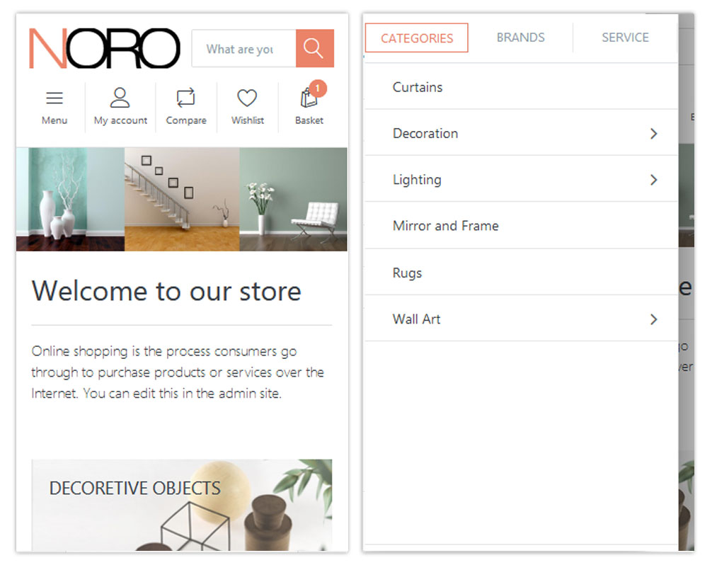
The theme header is neatly organized for a better user experience in mobile.
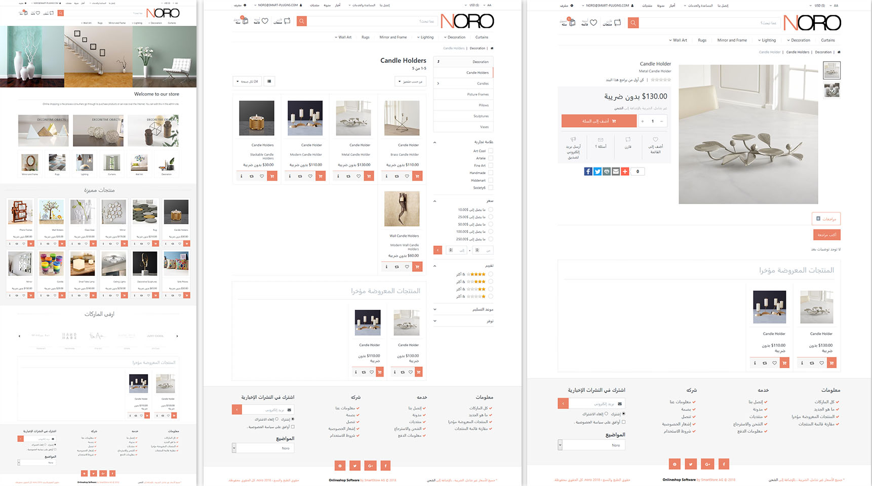
In RTL language regions, people read and write from right to left. This means that most interface elements should be flipped in order to be displayed correctly.
Supported versions 3.1.5
Reviews
Be the first to review this item
There are no reviews yet


